4 in 1
?
PixelNein
Caution: Experimental!
Something to show that antville layouts aren't all about colors & images. We can also get functionality most ants never even dreamed about :)
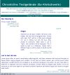
As stated above, this is experimental - meaning that it relies on the user to do the right thing. Basically, topics are used as sections:
Whatever has the topic "middle" will show up in the middle. We have the full program here. Stories with topic "left" will be a little more compact ("p" set to inline), but will still have title, creator & comments. When topic is set to "right", only storytext will be displayed. This is meant to work as a linkdump. Stories with a different topic or with no topic at all will use full width.
The look & feel is not ideal yet, and I admit that the css could be cleaner (no cross browser tests). But since I will be tied up with other projects for a while, I decided to put it out for everyone to play with. Since the functionality cannot be tested here without seriously destroying the purpose of the site, you can see it in action over at Kielschwein (set to public contributions) until I decide to try something new there. Or get the file to try it on your own site (not for the faint of heart).
4in1 (application/x-zip-compressed, 77 KB)


